Compare sectors across time periods
Review sector and index ETF performance from one session to ten years. Check the current trend and distance from the Market Pulse line alongside those returns.
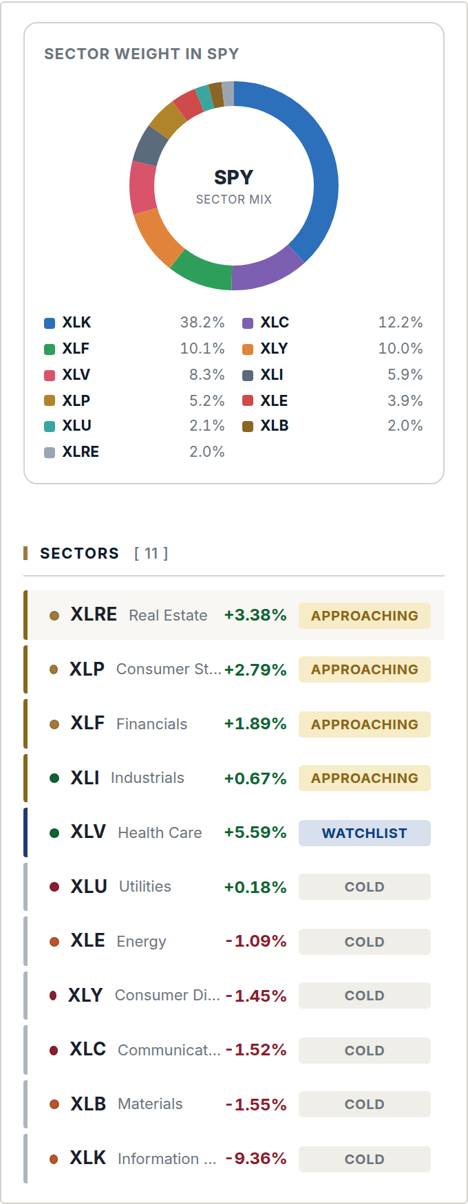
Example screen from the member area. Prices and signals change.
Technology: historical returns and current trend
Historical returns and the current trend answer different questions. Check both, then review the signal status before considering an entry.
Compare more than one period
Short and long periods can show different results. The table puts them together so you can compare them directly.
Performance and setup status
Historical performance
The return columns show how prices changed over different periods. The starting date affects each result.
Current setup status
The trend and distance from the Market Pulse line describe the current setup. Past returns alone are not an entry signal.
Open the trend history
Use the sector map to see the daily trend behind the current reading and compare the largest holdings.
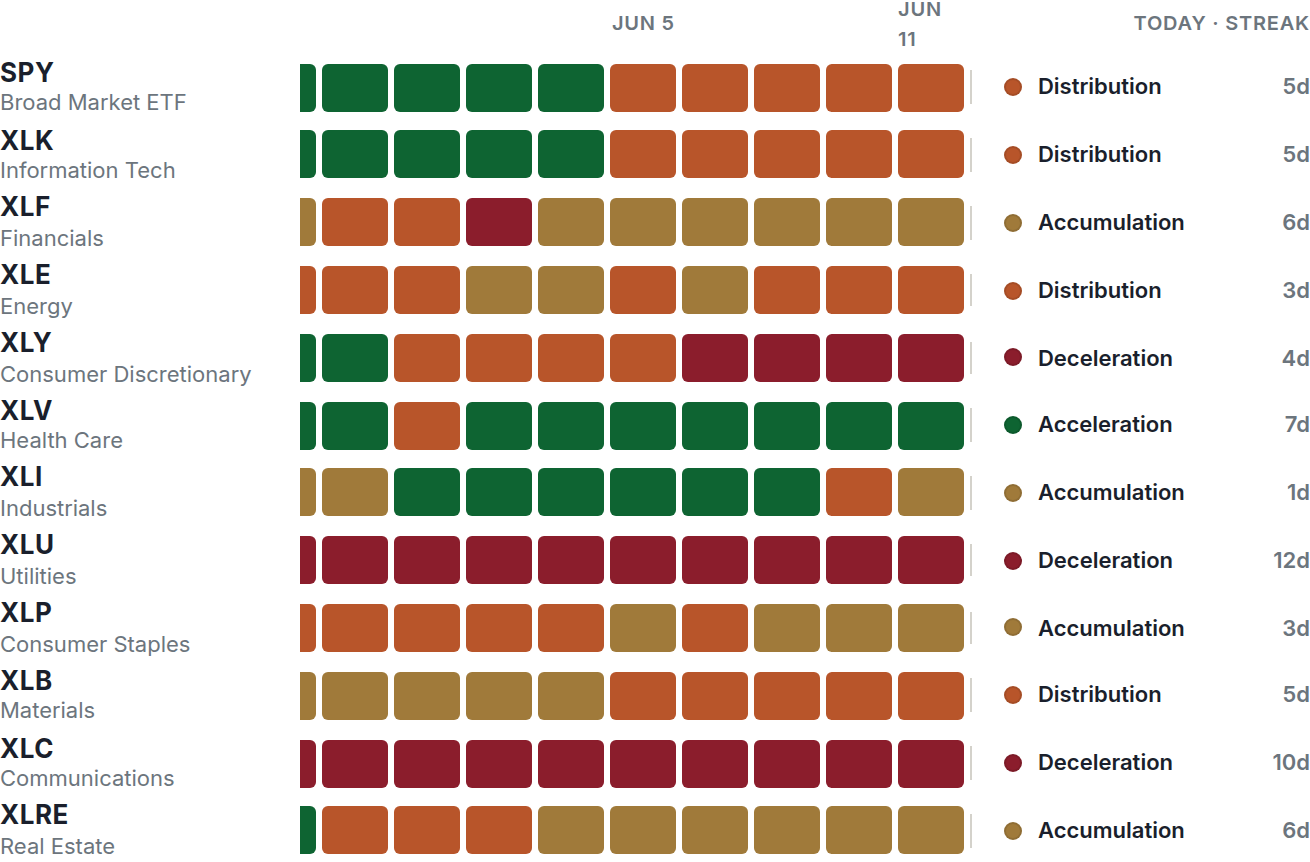
Explore the platform
Review the public performance summary, then compare the membership features and price.