See how sector trends have changed
Compare 60 sessions of daily trend history. Open a US sector to view its largest holdings and their weights, or switch to international and commodity ETFs.
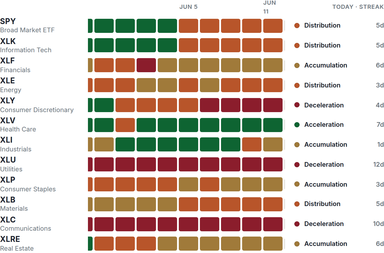
Example screen from the member area. Prices and signals change.
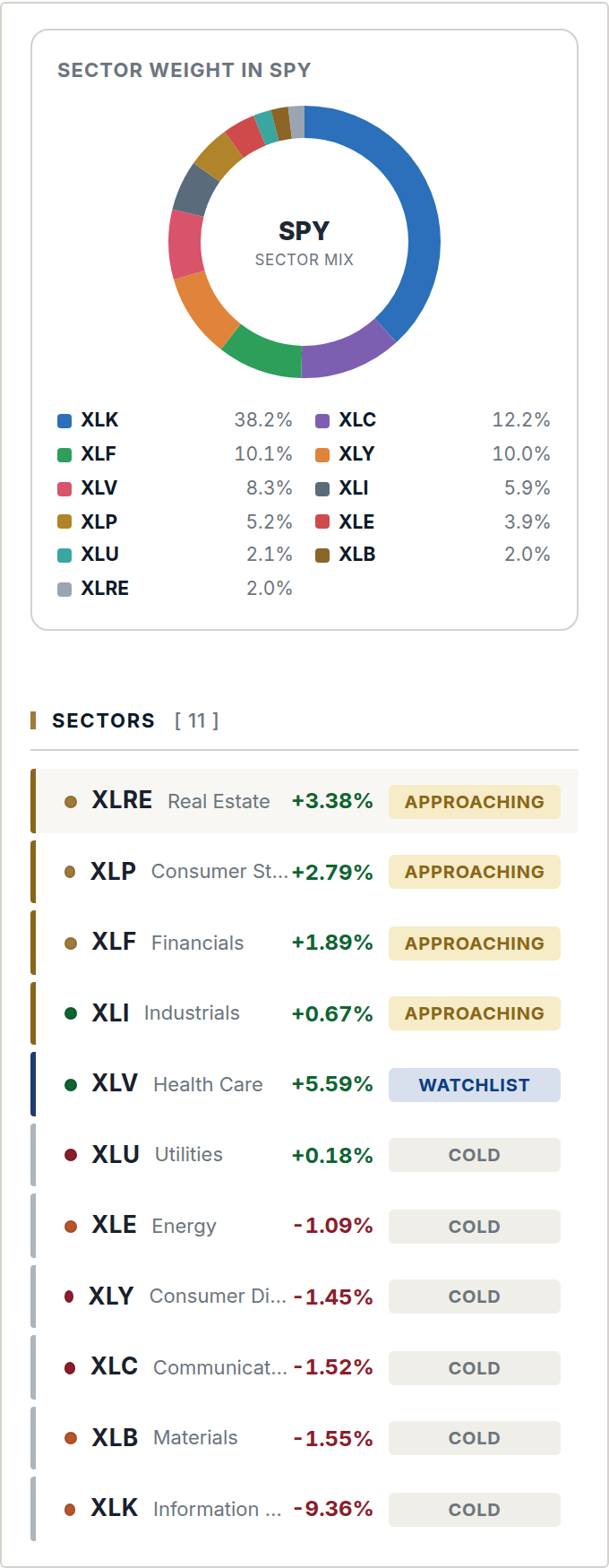
Technology holdings and concentration
Two names carry 30.1% of Information Technology. Compare their trends with the other holdings to see how broadly the sector is moving.
Track changes over time
The grid shows when a trend changed and how long it lasted. A color change alone does not mean every signal filter has passed.
Reading the grid
Across a row
Each square represents one session, with the oldest on the left. Look for sustained trends or frequent changes.
Across sectors
Compare the same date across rows to see whether trend changes are broad or concentrated in a few sectors.
Check the setup separately
A sector can stay green long after its entry signal. Review the signals page for qualifying setups and their dates.
Explore the platform
Review the public performance summary, then compare the membership features and price.